What is modern web design, anyway?
Despite the name, it’s less about the design trends and more about functionality. Because let’s be real: if your ideal client lands on your site and doesn’t know what to do, they’re gone before your video finishes loading.
Modern web design is about creating an experience. One that guides, supports, and gently nudges your visitor to take action — all without them even realizing it.
5 Tips To Create a Modern Web Design Experience
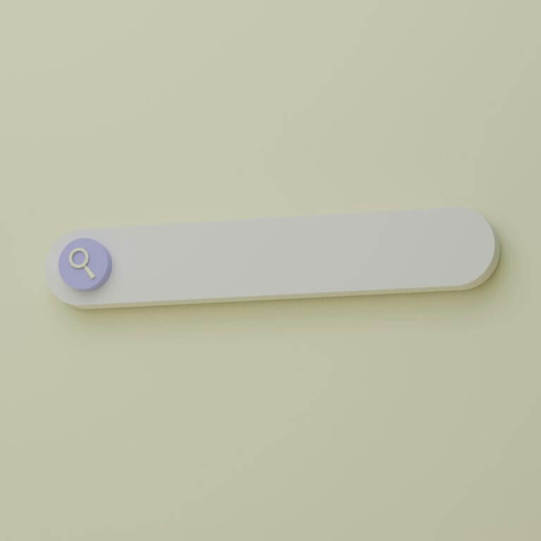
1. Make Navigation a No-Brainer
Your site should feel like a well-marked trail — not a corn maze. Your ideal client should be able to find what they’re looking for from multiple entry points: the navigation bar, a clear homepage button, or a CTA mid-page.
No cutesy or cryptic labels like “Peek Inside” or “Discover the Magic” — unless your brand is a crystal shop or children’s book author. Even then… be careful.
Tip: Stick with familiar phrases like “Work With Me,” “Shop,” “Our Services,” and “Contact.” Add a sticky nav or back-to-top buttons for longer pages. And always test it on a phone.
For Example: We recently revamped a tree care service website. In the main navigation we included a “Schedule a Consultation” button, so it is clearly seen on every page. We also included a larger call-to-action with the same button at the bottom of each page. This was done to make it as easy as possible for a site visitor to get in touch with them about their tree care needs.
2. Prioritize Mobile-First Design
Modern web design must work beautifully on all devices. Not just function, but feel good to use.
Most people will find you on their phone — likely while wrangling kids, sipping coffee, or between appointments. Your site should adjust instantly to their screen and remain intuitive no matter the size.
Tip: Use a responsive framework. Don’t just shrink elements — rearrange them so mobile layouts feel clean and purposeful. Buttons should be thumb-friendly. Forms should never require a zoom.
3. Clarify Your Call-to-Action (CTA)
Modern websites don’t play hard to get. If you want someone to schedule a consult, buy a product, or sign up for your newsletter, say it clearly — and make it easy.
A good CTA doesn’t just sit quietly at the bottom of your page. It should appear early and often — on your homepage, in the header or hero section, and again wherever your visitor might be ready to act.
Tip: Include a variety of CTA types — a “Book Now” button, a short embedded contact form, or a click-to-call for mobile users. Use action-driven language: “Let’s Talk,” “Grab Your Spot,” “Schedule a Free Call.”
For Example: You don’t want a simple “Learn More” it’s not clear to your ideal client what they’ll be learning more about and it’s not clear if someone is using a screen reader what they’ll be getting. Instead you want “Start Getting New Customers” or “See How We Can Help” or “Reserve Time with Us.” The more specific you can be about what they’ll get, the more likely they’ll click to learn more.
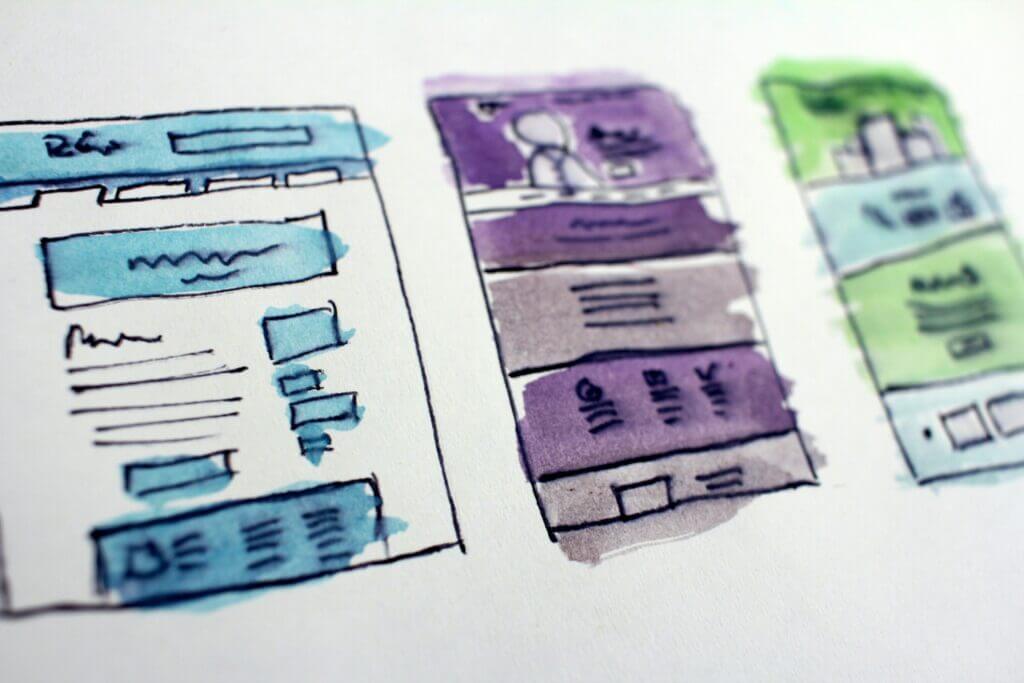
4. Write for the Skimmers
Modern web design pairs great visuals with digestible content. That means breaking up text with headers, bullet points, subheaders, and smart use of white space.
You want your site to be easy to scan — because people rarely read word-for-word. If they can grasp your value in a few seconds of scrolling, you’ve won.
Tip: Stick to one idea per paragraph. Use bold or larger font sizes for key phrases. Make sure your font is readable across devices (no script fonts for body copy, ever). And yes, color contrast must meet accessibility standards.
5. Use Visuals That Speak Without Screaming
Photos, icons, and design elements should support your message — not distract from it. A modern website doesn’t drown in stock images or rely on flashy effects to stay interesting. Instead, it uses visuals to reinforce your brand and guide the user experience.
Tip: Use images that reflect your brand’s personality and feel authentic. Feature your real team, workspace, or products when possible. And embrace white space — it gives your content room to breathe.
For Example: We recently built a website for a consultant. The imagery we used was very specific and intentional. We stuck with our color palette, and used various versions of his headshots in key areas. We also sprinkled in relaxing scenes which helped speak to his ideal client, showing them that’s where they can get to if they hire him to help them strategize their business.
So What Is Modern Web Design?
It’s clean, functional, intentional.
It doesn’t follow every trend. It doesn’t try too hard to impress. It just works — so smoothly that your ideal client doesn’t even realize how easily they found what they needed, contacted you, and took action.
It’s a clear brand.
It’s a thoughtful user experience.
It’s a feeling.
When it’s done right, your website becomes your best salesperson. Quietly doing its job in the background — 24/7 — converting ideal clients into real clients.
And that, right there, is modern web design.
Frequently Asked Questions
How is modern web design different from traditional web design?
Traditional web design often prioritized looks over functionality. In contrast, modern web design balances aesthetics with performance, prioritizing usability, responsiveness across devices, accessibility, and conversion-focused layouts.
Why is mobile-first important in modern web design?
A mobile-first approach ensures your website looks and functions perfectly on smartphones and tablets. Since most users visit websites on their phones, modern web design must adjust layouts and elements to provide a seamless mobile experience.
What makes navigation “modern” on a website?
Modern web design treats navigation as a critical user experience feature. It includes clearly labeled links, sticky menus, and easily accessible buttons, ensuring visitors can find what they need quickly, without confusion or unnecessary clicks.
How do you write effective calls-to-action in modern web design?
In modern web design, CTAs are clear, direct, and action-driven. Instead of vague phrases like “Learn More,” modern CTAs use specific language like “Schedule Your Free Call” or “Start Growing Your Business,” and are placed throughout the site to guide users at every stage.
How does content layout play a role in modern web design?
Modern web design favors content that’s easy to skim. This means using headers, bullet points, short paragraphs, and white space to improve readability and help visitors quickly understand your value without reading everything word-for-word.