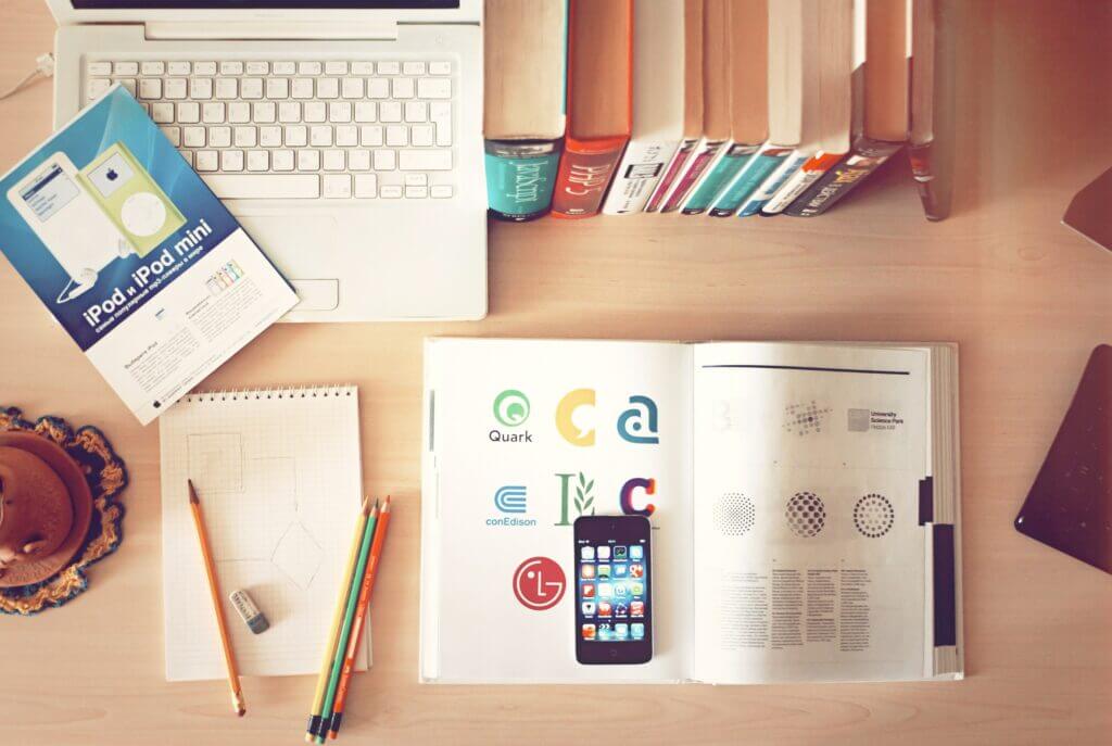
We don’t always design the logos for the companies we build websites for. And sometimes, not doing the logo design can pose a problem! Why? Because the designer didn’t think about all the uses that the logo may have. (This is a HUGE reason why you should spend the money and create a real brand for your business, not do it cheaply on the side).
An Example of What Can Happen
What we have found that happens is you get a logo design and that’s it. You get the logo in one format, that is all. For example let’s say you get a vertical logo.
- Now you’re going to create your website, but man, you really wish you had a horizontal version of your logo because that format would work so much better on the web.
- Next, you go to set up your social media pages, and realize your logo gets cut off in the square or circle (depending on the social media site) they give you for your profile. Again, you’re wishing for another version or element of your logo to use.
- Now, it’s time to create company swag. Hats, t-shirts, stickers, promotional items, and each thing you go to create has a slightly different ratio of artwork allowed.
You either butcher your logo by stretching it or reshaping it to get it to fit in these different formats. Or, you spend more money getting pieces of it created (often by designers that aren’t branding experts). Or, you end up going completely off-brand and using artwork that really doesn’t look or relate to your initial logo. None of these scenarios are good.
Another Example of What Can Happen Post Logo Design
You hire a designer, and they provide you with a beautiful multi-colored logo and various different layout formats and icons. Sweet. You’ll have what you need for Swag, your Website, your Social accounts, etc. But….
- You go to order Swag and need a 1 color logo for the stitching. You realize that your logo won’t work in one color. Now what do you do?
- You go to size down the horizontal logo to fit into the area on your website and realize the way it was designed and created is unreadable at that small size. Now what do you do?
These issues happen more often than you think. It’s why you need to know what to look for and be prepared to ask questions. A good designer will always be able to answer them.
Another tip, if you hire a larger company to do your branding, ask for the designer to be in any design-related meetings. Talk to them about what you’re looking for and how you’ll be using the logo design. ALWAYS look at black and white designs of your logo. Scale them and make sure they work at 200px wide (or ask the designer to show you).
Branding
Remember, your logo design isn’t your complete branding. It is 1 part of it. The other part of it is fonts you want used, and colors you want used. Some brands have web fonts vs. print fonts.
Personally I like to spec Google Fonts for my clients as then anyone on their team can download and use them for anything they are creating. You can also use standard fonts for everything. When you start getting into fancier fonts, make sure you know the licensing and you purchase the appropriate one if you are going to use it.
For brand colors you should always have a specified CMYK, RGB and HEX code that you provide to anyone doing design work for you. This is important so that your colors ALWAYS look the same. RGB and HEX are for digital work, CMYK is for print work.
If you plan on printing swag, you may want to pick a Pantone color as well, as many printers will want that color when they do the printing, but it is not necessary for most things. If you do plan on doing a lot of print, or just want to make your life easier and have Pantone Colors selected for your brand be sure to let your designer know that ahead of time as that can narrow down the color palette a bit!
And, if you don’t pick them, and do need them in the future keep in mind that there are color matches to tell you what Pantone is the closest to what you’re using, but it may be a little different than your typical colors.
Logo Design + Branding Summary
Don’t go for cheap or easy branding. You get what you pay for. Make sure you see your logo in Black and White to Start with. Make sure it works in a small format and make sure you have different arrangements of it that can work in Horizontal, Vertical, Square or Circular spaces. Know your colors and fonts, and be sure to always share that information with anyone who does design work for you.
I hope this helps you know what to look for, and what questions to ask so you get a logo you love and can be used for years to come. If you’re ready to get started on your branding, contact us and we’ll set up a design consultation to get your brand on it’s way.
Frequently Asked Questions
Why should I invest in professional logo design?
Investing in professional logo design ensures that your logo is not only visually appealing but also functional across different formats. A professional designer will consider various uses of your logo, such as websites, social media, and print materials, ensuring consistency and scalability across all platforms.
Can I use the same logo design across all platforms?
Not necessarily. Different platforms, such as websites, social media, and promotional materials, may require different logo design formats. A good designer will provide multiple versions of your logo, including horizontal, vertical, and simplified icons, to ensure it works seamlessly across all platforms.
What are the common mistakes in logo design?
One common mistake in logo design is not considering scalability. A logo that looks great at large sizes may become unreadable when resized for mobile devices or social media. Additionally, using only one format or color can limit the logo’s versatility. Always request different versions and formats to avoid these issues.
What file formats should I request for my logo design?
One common mistake in logo design is not considering scalability. A logo that looks great at large sizes may become unreadable when resized for mobile devices or social media. Additionally, using only one format or color can limit the logo’s versatility. Always request different versions and formats to avoid these issues.
How do I ensure my logo works in black and white?
To ensure your logo design works in black and white, ask your designer to provide a black-and-white version of the logo. This is especially important for printing purposes, such as on merchandise or promotional items like hats and t-shirts, where color printing may not always be possible.