This year, I decided I wanted new branding for Creare. It was feeling a bit outdated to me, and I wanted to get more of a natural feel from it than I was getting. As part of the evolution of a brand, I focused on refreshing its look and feel to better reflect the direction I envision moving forward.
Starting to Make a Change
First, I went to fonts.google.com and typed in Creare. I started playing with the filters, and going through the different fonts. I narrowed them down and then downloaded them to my computer.
Next, I opened up Adobe Illustrator and started playing with layouts. I knew I liked the sans serif font I’d been using since 2017 (Lato) and I wanted to keep that for “web solutions.” So, I played around until I came up with a font I liked that went well with it.
Then, I started playing with color palettes. Lots of them. Nothing like what I had, to slightly different versions of the colors I’d been using. I tend to like green, and am drawn to it, but when I was working through the palettes the green just wasn’t working.
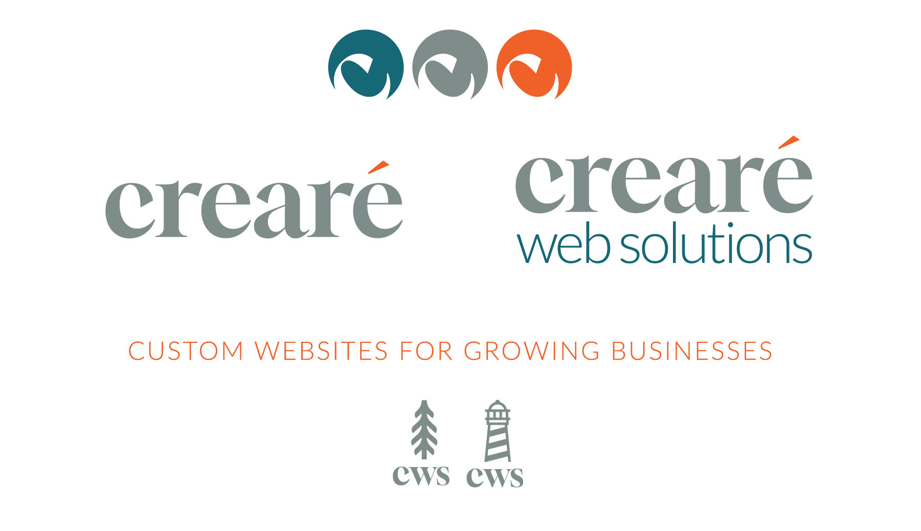
Finding The Right Color Palette
Finally, I landed on a gray-green as the main color with an accent of a red/orange (similar to what I’ve always had) and a dark blue/green (similar to what I used originally, although I came to this without realizing that at first!). I felt like together these colors were strong, while still invoking the feeling I wanted to the logo to have.
I like the combination of the Red/Orange as the colors together signify importance, command attention and evoke an energy, all of which I want my brand to do. Combining it with a Dark Blue/Green signifies professionalism and trustworthiness as well as stability, growth and of course nature. Rounding it out is the Gray/Green which is both classic and neutral.
Not The First Branding Update
This wasn’t the first time I felt like the brand needed a facelift. Back in August of 2017 I revamped the Creare brand when I realized I wanted less clients focused just on “Marketing” and more focused on the entire web picture or “Web Solutions” which is what we were providing.
At that point, I changed the name from Creare Marketing to Creare Web Solutions. I also dropped the Serif font and used a Sans Serif, but kept the script. The evolution of a brand is a continuous process, and this time, I’m not changing the name, but I realized we often call ourselves just Creare, so why not use that alone? However, I felt the script just looked a bit outdated, and really liked the look of the chunkier serif font.
I’d love to hear more about what you think of the evolution of the brand, and if you like the new branding package I’ve put together (above). Or, if you think your brand may need a facelift, reach out! It’s fun to evolve a brand, it shows you’re always thinking and always creating!
Frequently Asked Questions
u003cstrongu003eHow can the evolution of a brand impact a business’s success?u003c/strongu003e
The evolution of a brand helps businesses stay relevant and align with their target audience’s expectations. Regularly updating your brand’s look and feel, as well as its messaging, allows you to strengthen customer connections and enhance your business’s professional presence, ensuring long-term growth and success.
u003cstrongu003eWhy is it important to update your brand as part of its evolution?u003c/strongu003e
Brand evolution is crucial because it allows your business to remain competitive. Whether it’s adjusting your color palette, tweaking your logo, or shifting your brand’s messaging, the evolution of a brand keeps it fresh and aligned with modern design trends and market needs. A strong, updated brand image can attract more customers and increase engagement.
u003cstrongu003eHow often should a brand undergo an evolution?u003c/strongu003e
There’s no set timeline for the evolution of a brand, but it’s essential to reassess your brand every few years or when significant changes occur within the business or industry. Constantly reviewing your brand’s evolution helps keep it relevant and effective as trends and customer expectations evolve.
u003cstrongu003eWhat are some signs that your brand needs an evolution?u003c/strongu003e
If your brand feels outdated, doesn’t resonate with your target audience, or your competitors have adopted more modern approaches, it might be time for an evolution of a brand. Look for changes in customer preferences, market trends, and your business’s growth to determine if your brand needs to evolve.
u003cstrongu003eHow do I start the evolution of a brand?u003c/strongu003e
Starting the evolution of a brand involves reviewing your current branding elements and identifying areas that need improvement. This could be a visual update, refining your messaging, or expanding your offerings. It’s important to start with clear goals and focus on what best represents your business’s vision for the future.